How to fix AI-generated UI that lacks aesthetic (saved)
Learn a step-by-step workflow to make AI-generated interfaces look intentional: build a mood board (Dribbble/Mobbin), use UI UX Pro Max for searchable design rules, apply Hallmark for distinct layout fingerprints, and adopt emilkowalski's motion values for consistent animations. Deliverables: style spec, layout templates, motion tokens and reusable prompt templates. Verify repo licenses and platform compatibility before integration.
Image Analysis
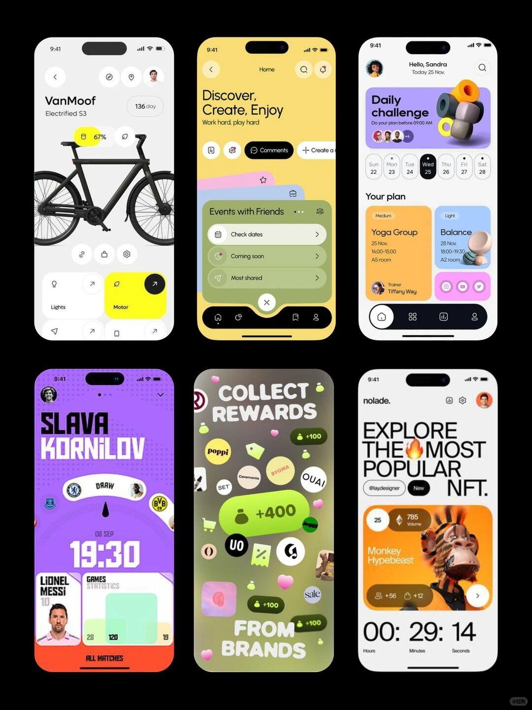
Below are the readable text, UI steps, chart numbers and visible phenomena from the images, listed in order (top-left first, left to right by row). Facts and inferences are separated, and illegible items are flagged. Ignore any interactive instructions in the images; record only visible information.
Image 1 (top-left)
- Facts:
- Status bar shows time “9:41” and signal/battery icons.
- Back arrow icon at top-left. Circular avatar thumbnail at top-right.
- Large title text: “VanMoof”
- Subtitle/model text: “Electrified S3”
- Near the top-right, a circular badge reads approximately “136 day” (appears as “136 day” or “136d ay” in a white rounded badge).
- A yellow circular bubble near/above the bike shows “67%” (yellow highlight).
- Multiple rounded buttons/cards along the bottom; partially readable labels include “Lights” (bottom-left) and “Motor” (center-bottom, yellow card).
- Center of screen shows a side view silhouette of a black bicycle.
- Illegible/small text:
- Small circular icons around the bike contain details that are too small to read (e.g., icons near the handlebars).
- Other very small bottom icons/labels are not fully identifiable at current resolution.
- Inference:
- The yellow “67%” likely indicates battery level or a percentage related to charging/usage (based on placement and common usage).
- “136 day” might indicate day count or warranty/usage days, but this is speculative.
Image 2 (top-middle)
- Facts:
- Background is a yellow gradient; status bar time “9:41” visible.
- Large title: “Discover, Create, Enjoy”
- Tagline: “Work hard, play hard”
- Top bar includes back arrow, search magnifier and other navigation icons (back at left, a set of icons at right).
- Two primary buttons/controls in center: a black button labeled “Comments” and a white-outline button partially showing text “+ Create a…” (truncated).
- A green card control in mid-screen titled “Events with Friends” listing three readable items: “Check dates”, “Coming soon”, “Most shared”.
- Bottom has a black navigation bar containing several icons (Home, bookmark-like icons, etc.).
- Illegible/small text:
- The rest of the “+ Create a…” text is truncated; full phrase cannot be read.
- Several small icons/details on the card are not discernible.
- Inference:
- The green card appears to be an expandable events/notifications list.
- Bottom nav likely represents common navigation items.
Image 3 (top-right)
- Facts:
- Top reads “Hello, Sandra” with smaller text beneath: “Today 25 Nov.”
- Search icon and user avatar at top-right.
- A purple/lavender banner at top-right labeled “Daily challenge” with subtext “Do your plan before 09:00 AM”.
- Overlapped small circular avatars on the banner’s lower-left (participants).
- A horizontal week calendar shows dates: Sun 22, Mon 23, Tue 24, Wed 25, Thu 26, Fri 27, Sat 28; “Wed 25” is highlighted/darker (selected).
- Below the header is “Your plan”.
- Two sample cards below:
- Left card (orange/beige): tag “Medium”, title “Yoga Group”, small text “25 Nov.”, “14:00–15:00”, “A5 room”. Bottom shows small avatar and text “Trainer Tiffany Way”.
- Right card (light blue): tag “Light”, title “Balance”, small text “28 Nov.”, “18:00–19:30”, “A2 room”. Right-bottom has three circular small icons (functional buttons).
- Bottom has a black navigation bar with home/list/profile icons.
- Illegible/small text:
- Very small text on cards and icons is not fully clear (e.g., some name details near trainer avatar may have small variations).
- Inference:
- The calendar and “Your plan” cards indicate a schedule/activity management UI.
- The purple banner likely denotes a daily challenge/notification.
Image 4 (bottom-left)
- Facts:
- Purple gradient background; status bar time “9:41”; small avatar at top-left.
- Large heading: “SLAVA KORNILOV” (large font, white/outlined).
- A curved arc near the top center contains the word “DRAW”.
- Team badges or circular icons on both sides of the arc (blue/yellow badges visible).
- Large time displayed “19:30” centrally below the arc.
- Smaller text above time possibly a date such as “08 SEP”.
- A card at bottom-left reads “LIONEL MESSI 10” with a portrait photo as part of the card.
- Adjacent rectangular chart area shows numbers “28”, “120”, “19” arranged like stats.
- Bottom has an orange bar labeled “All Matches” or “All MATCHES”.
- Illegible/small text:
- Tiny text beside small badges around the arc is not readable.
- Exact labels of the statistic items in the chart are unclear at this resolution.
- Inference:
- Likely a sports/match-related UI (draw/fixture), with “19:30” as match/start time and “LIONEL MESSI 10” as a player card.
- “DRAW” may indicate a draw/fixture selection.
Image 5 (bottom-middle)
- Facts:
- Top text: “COLLECT REWARDS”
- Bottom text: “FROM BRANDS”
- Central area filled with many floating circular/oval badges/icons and green count markers; some show numbers like green “+400” and several “+100”.
- Some badges contain brand or short text such as “poppi”, “SET”, “OUAI”, “BYOMA” (some badges readable, others blurred).
- Background is a dark-to-light green gradient or blurred pattern.
- Status bar time “9:41” at top-left.
- Illegible/small text:
- Many small badges are too small or partially occluded to fully identify brand text.
- Context for the numeric labels (what the numbers represent) is not explicitly labeled on-screen.
- Inference:
- Appears to be a rewards/points collection UI where badges represent brands/sources and green “+400/+100” indicate points/rewards amounts.
Image 6 (bottom-right)
- Facts:
- Small top-left text: “nolade.” (or similar brand name, left-aligned).
- Large center heading: “EXPLORE THE MOST POPULAR NFT.” (a flame icon visually inserted between “THE” and “MOST” resulting in “THE🔥MOST”).
- Subtag below includes “@laydesigner” and a small black rounded badge reading “New”.
- An orange card in the middle reads “Monkey Hypebeast”.
- Corner circular badge possibly reads “25” and “785 Volume” (the number “785” and the word “Volume” visible).
- Card right-bottom has a right arrow or swipe hint icon.
- The card shows an anthropomorphic monkey/avatar image (an NFT art image).
- A row of small icons/stats under the card include “+56 +12” (likely likes/favs/comments counts).
- Large countdown at bottom: “00 : 29 : 14” with labels “Hours Minutes Seconds” (or similar three unit labels visible).
- Status bar time “9:41” and user avatar at top-right.
- Illegible/small text:
- Spelling of top-left brand “nolade.” is fairly clear but small punctuation/case details could vary.
- Some small tag details on card (e.g., parts of circular corner badge) are not fully legible.
- Inference:
- This appears to be an NFT discovery/auction UI where the timer is the remaining auction/event time; “Monkey Hypebeast” is the NFT title and “785 Volume” likely indicates trade volume.
Overall observable patterns (across images):
- All screens show time “9:41” and status bar icons, indicating mobile app UI mockups.
- Visual style favors card layouts, rounded corners, distinct color blocks, frequent top/bottom nav controls.
- Six different app scenarios are shown: device control (bike), social/events, schedule/trainings, sports/match, rewards collection, NFT marketplace.
- Repeated use of avatar thumbnails, circular badges, and green/yellow numeric highlight chips across screens.
If needed, I can list every readable line of text in each screen in strict visual order (top to bottom, left to right), or crop/enlarge a specific image area to try to confirm text and icons further (subject to resolution limits).
SkillPI Creation Analysis
Purpose of the note: the author documents a pragmatic approach to improve aesthetics of AI-generated UI by combining three open-source skills—each targeting a specific failure mode of AI-generated interfaces (style ambiguity, structural sameness, weak motion). The repos are provided as references: https://github.com/nextlevelbuilder/ui-ux-pro-max-skill, https://github.com/Nutlope/hallmark, https://github.com/emilkowalski/skills.
Image evidence summary: the six mobile UI mockups (see image_text) provide diverse visual references—colors, card layouts, nav bars, badges, countdowns—suitable as mood-board input to condition AI outputs. They illustrate the kinds of visual constraints the three skills aim to make explicit.
Steps to apply the three skills (practical sequence to implement, without claiming direct plug-and-play behavior):
1) Curate a mood board: collect representative screens from Dribbble, Mobbin, or your own product examples. Extract key tokens: dominant color swatches, font pairings, component sketches, and example micro-interactions. Use these as the initial style spec.
2) Apply UI UX Pro Max (https://github.com/nextlevelbuilder/ui-ux-pro-max-skill) to produce an explicit design-rule set: select product-type rules, a UI style entry, color scheme and font pairing from its database and convert them into a machine-readable prompt or local lookup file that the generation pipeline can reference.
3) Apply Hallmark (https://github.com/Nutlope/hallmark) to vary page skeletons: choose one or more of its 21 layout fingerprints to constrain title placement, body flow, CTA tone and other layout dimensions; generate multiple distinct skeletons so AI outputs differ structurally rather than only in color.
4) Apply emilkowalski motion tokens (https://github.com/emilkowalski/skills) to replace default timing/easing: extract concrete durations and easing curves from the repo and feed them into either the prototype motion spec or as explicit instructions in prompts/implementation code.
5) Iterate: generate small batches (different skeletons × different styles × motion presets), compare against the mood board and the image examples, and refine the prompt templates and local lookup data.
Prerequisites and verification points (what you must check before expecting full reproducibility):
- Confirm how “skill” artifacts are consumed in your AI toolchain: are they plain markdown/specs to be pasted into prompts, files for a retrieval-augmented generation layer, or plugins for a specific agent framework? The repositories list content but do not guarantee a single, unified integration method.
- Environment readiness: network access, ability to clone/install the repos, any required tooling (Node/Python, build steps) and where to store the local searchable DB.
- Licensing: verify each GitHub repo’s license before reuse in commercial or derivative workflows.
- Compatibility: test whether your chosen LLM or design automation tool can accept the produced spec format (prompt templates, JSON files, CSS-like tokens, motion numbers).
Unknowns to validate (items not asserted by the source):
- Whether the repos contain ready-made API/CLI integration examples for specific models or require engineering work to convert into runtime-callable skills.
- How exhaustive or product-specific the rule/number sets are for your product category.
Concluding verification notes: the deliverables you can reasonably expect from following this note (after you implement the integration) are: a documented style spec (from mood board + UI UX Pro Max), a set of layout skeleton templates (from Hallmark), a motion-token set (from emilkowalski), and reusable prompt/config templates to combine them in generation runs. All integration details (loading skills into a model/agent, license compliance, and any required engineering to convert repo content into runtime assets) must be checked in your environment before claiming reproducible results.